No map needed.
What do bus route, rideshare, and taxi apps all have in common?
In this project, we wrangle a de facto "necessity" of map-based navigation apps in the delivery of value. What if a map, just made things more complicated?
Could we cultivate wider appeal of a transit service by simplifying to only what's needed?
We think so. Transit is now full circle.
The Problem
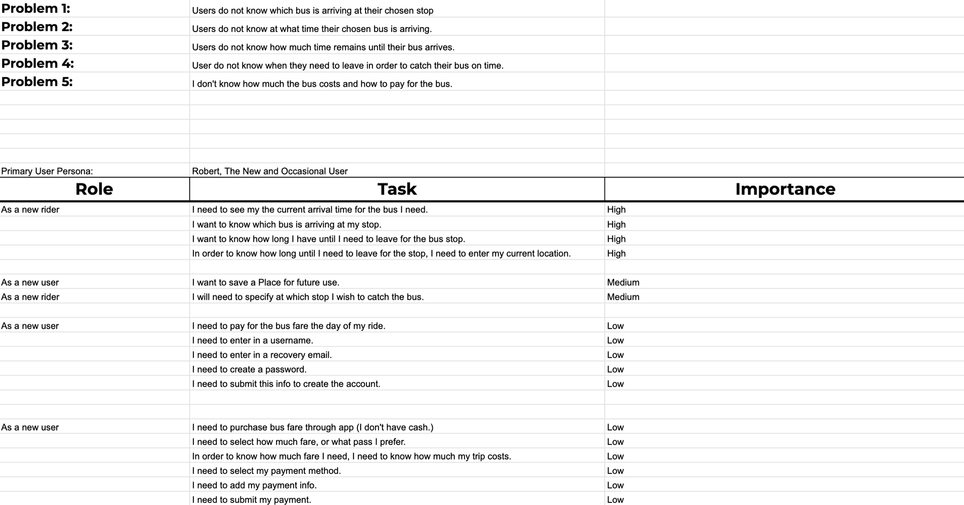
Users of a transit app are missing the bus at a particularly busy station and currently have no way of knowing the arrival time of their bus, nor which bus is arriving.
Simply stated: Riders can't feel confident in the current transit app.
Roles & Responsibilities
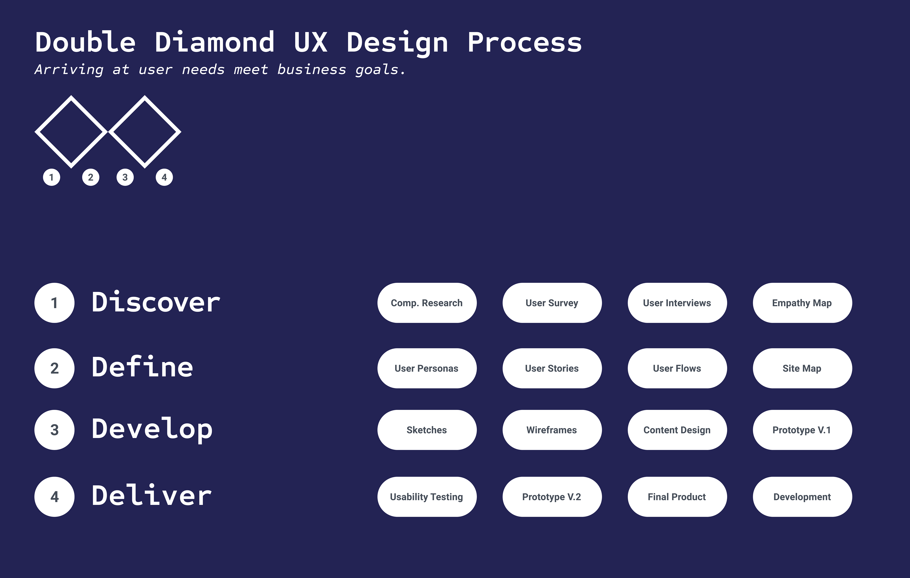
UX Researcher & Designer: Use the double-diamond UX process to acquire and harness insights gained through competitive and user research and weave them into a user interface design.
UX Writer: Leverage content design to appeal to a broad user base while supporting UX to serve business goals.
UX Strategist: Translate all insights towards service of user needs and/or business goals
Deliverables
A strategic on-boarding user flow and accompanying prototype app environment.
See the full prototype here: (Figma Link)
See the full prototype here: (Figma Link)
Tools
Cloud-based design software, Figma.
User Testing Platform, Maze.
Google Forms, User Surveys.
User Testing Platform, Maze.
Google Forms, User Surveys.
Target Market
People who've ridden the bus at least once in the past 3 years, verified through the use of a survey screener.
The Solution
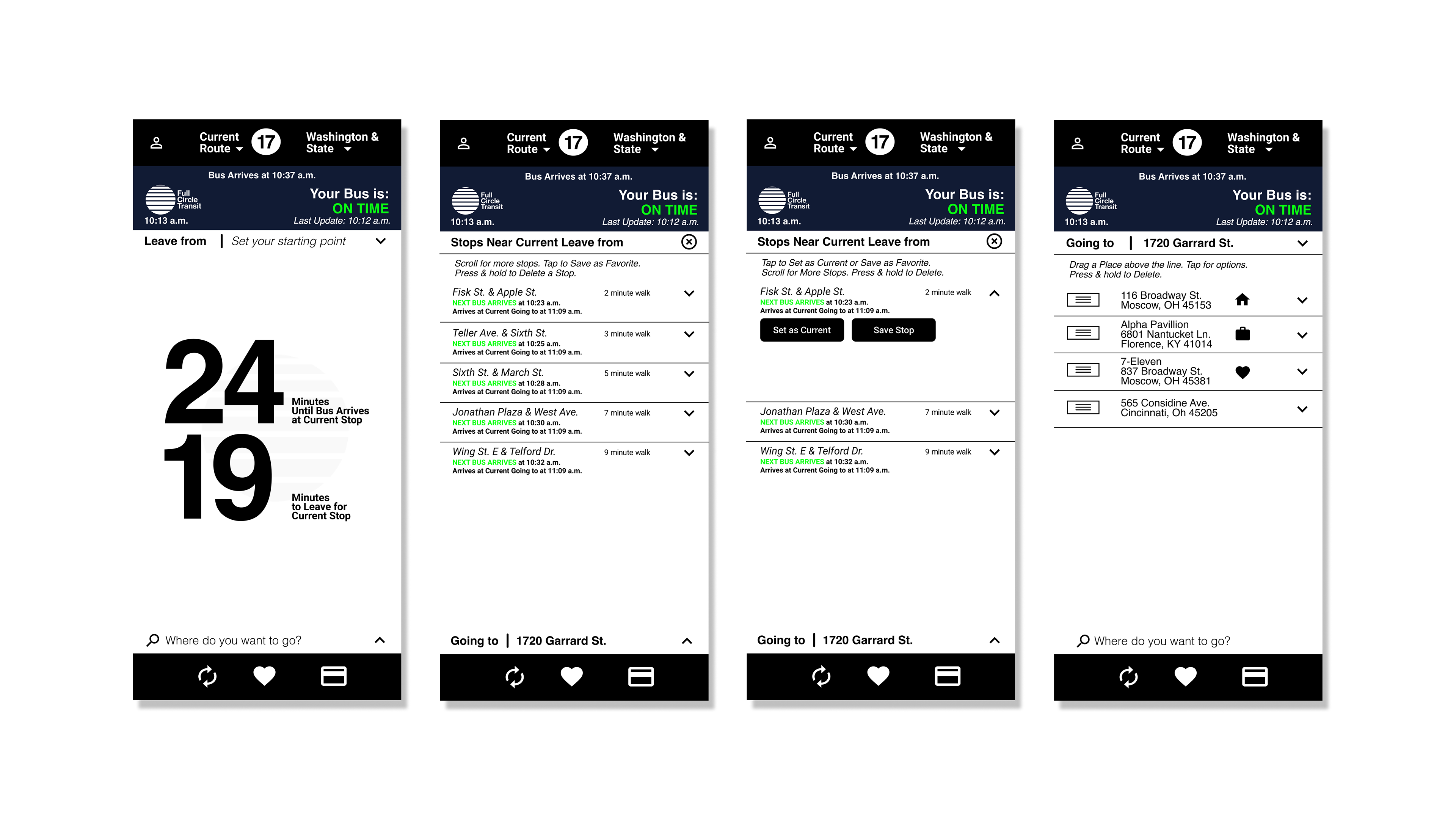
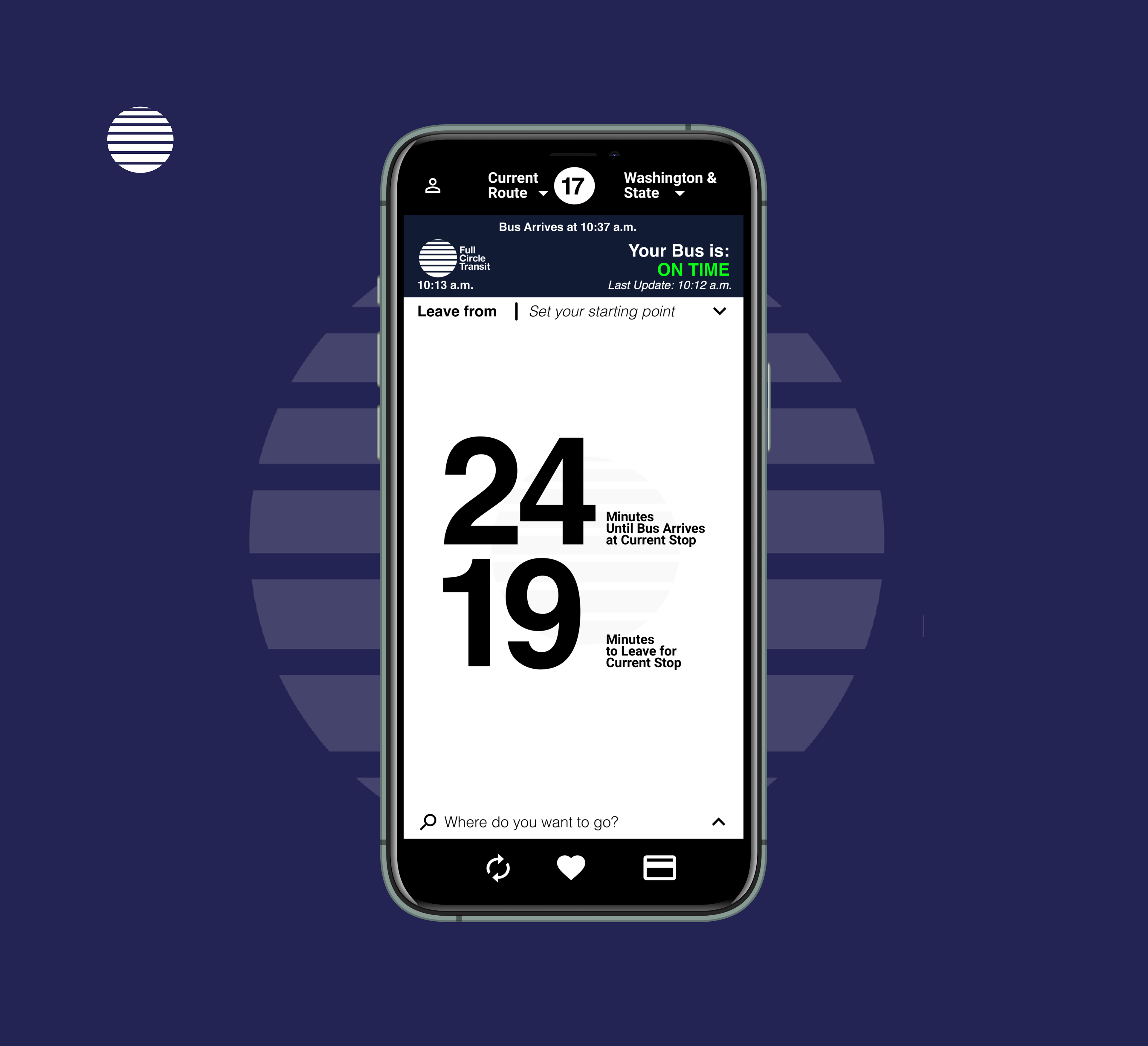
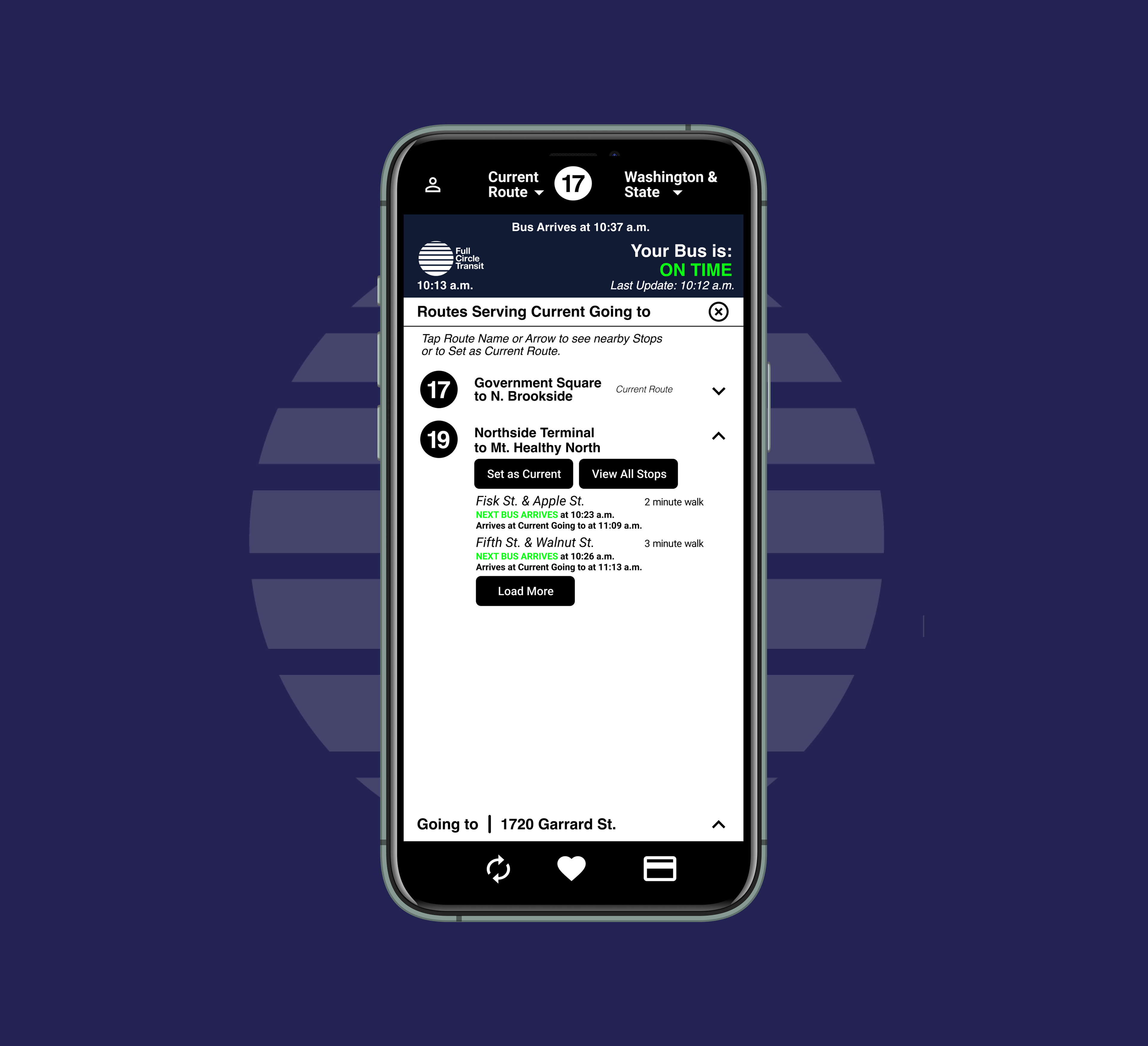
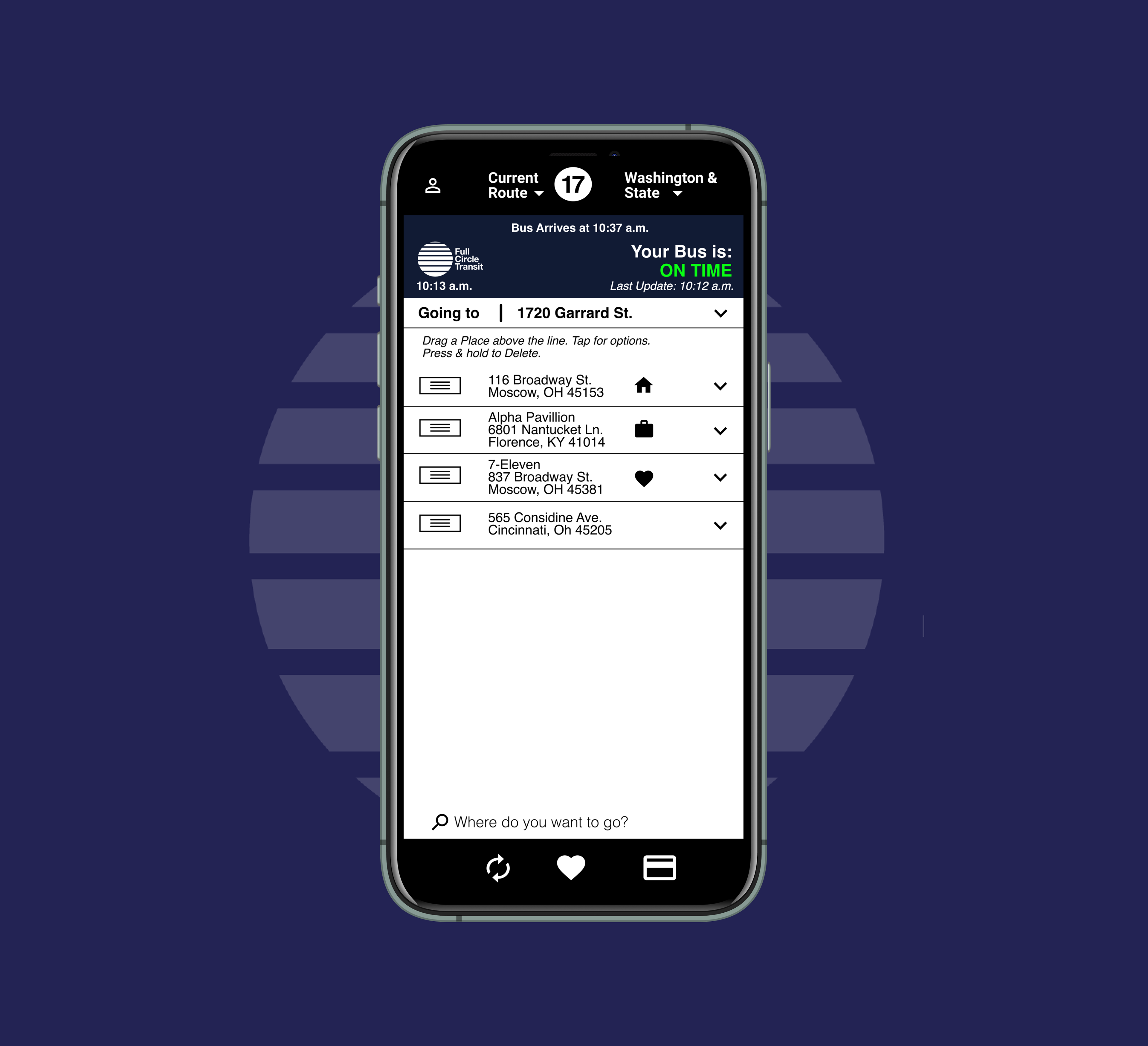
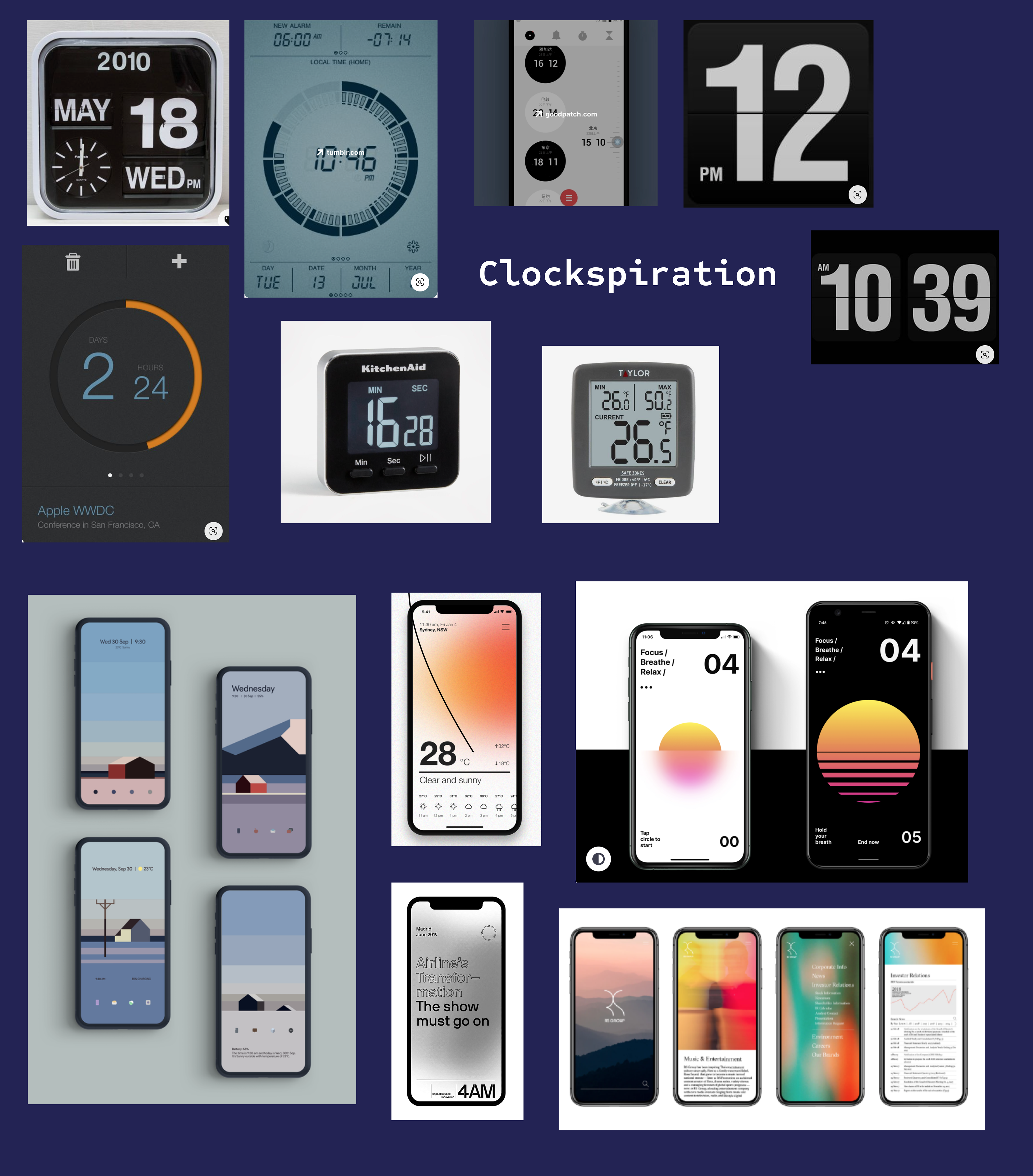
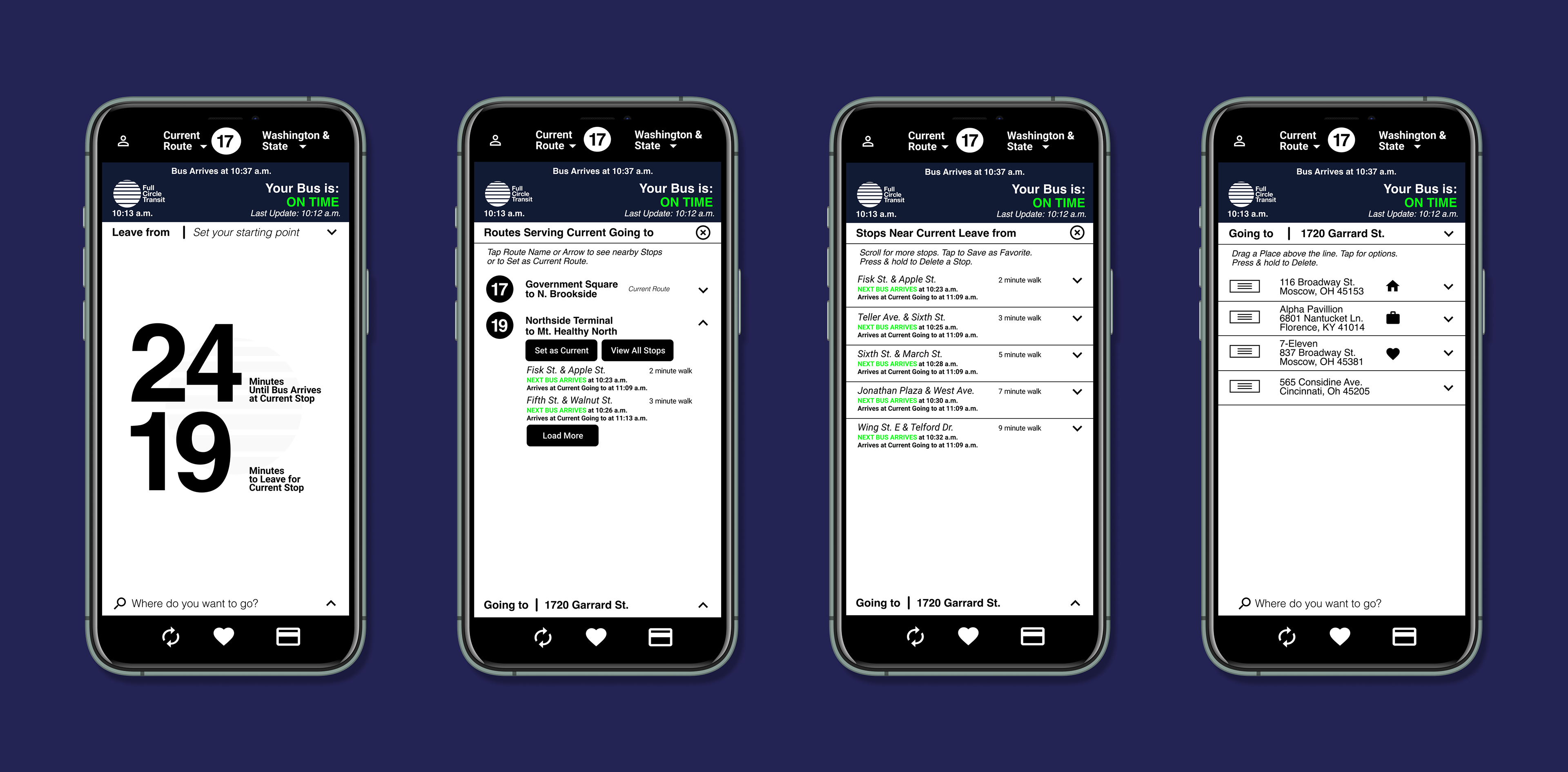
A minimalist, clock-inspired interface strives to present information in a way virtually any user can comprehend.
Typography and intuitive design elements are remarkably human.
A direct, no-nonsense approach to the presentation of information, organized visually into a hierarchy of importance according to user needs.
The Process
Competitor research began the process and revealed opportunity and direction. Friendly-feeling apps were numerous and so the question arose: How could we do it different?
Defining the problem, the user needed to feel confidence. A serious, no-nonsense visual approach made sense.
It was time to talk to users.
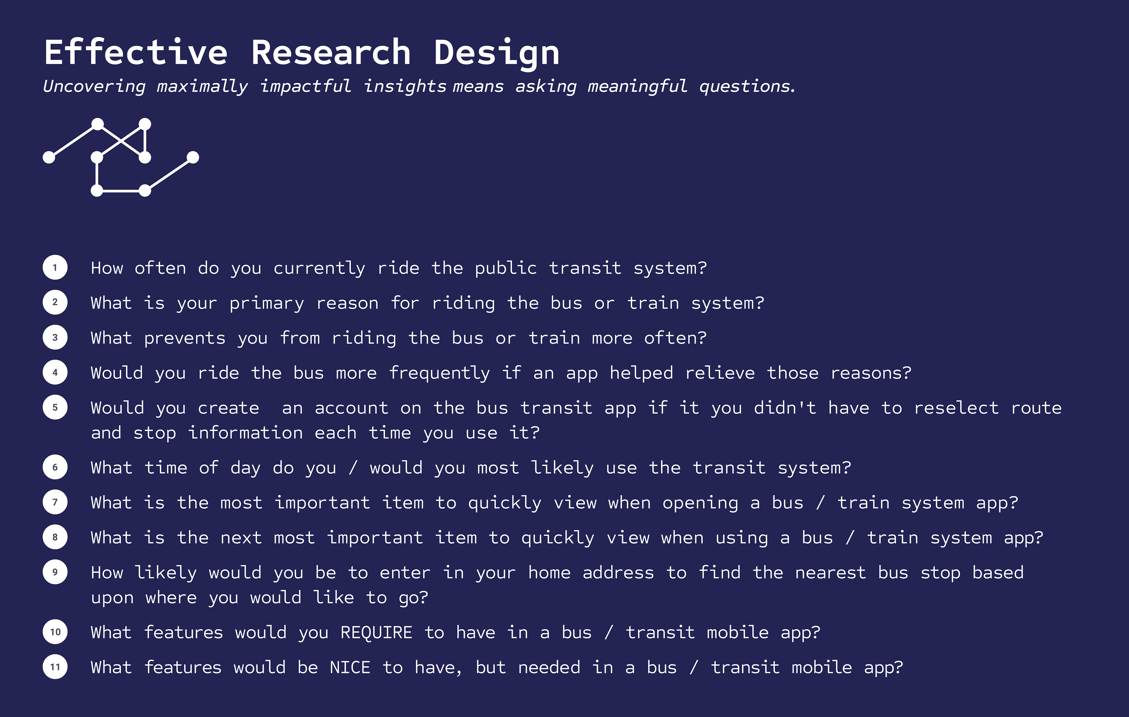
The survey questions were structured around uncovering information that could support business goals: Converting part-time riders into regular riders.
Empathy helps to realize effective questions. We asked about rider frequency as it relates to usage and uncovered an exciting divide that validated assumptions.
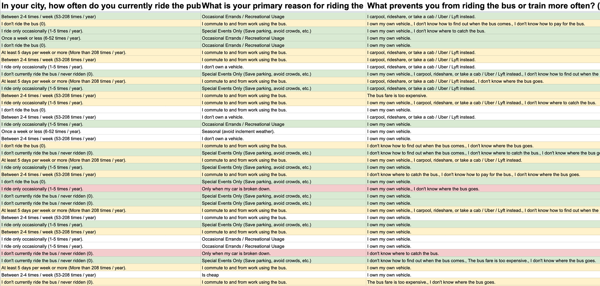
Responses were formatted into a spreadsheet to examine for correlations in the data.
Key correlations arose between rider type and feature desirability to be harnessed in design.
Two primary “rider types”
•Commuters - ride the bus more than 2x per week (up to 5x)
•Commuters - ride the bus more than 2x per week (up to 5x)
•Infrequent / Occasional - ride the bus 1-5x per year or less
Most important info to quickly view when opening the app
•Current Arrival time for my Bus (51 percent of responses)
•Current Arrival time for my Bus (51 percent of responses)
•How long / what time until I need to leave for the bus stop (18 percent of responses)
•How long it will take to arrive at my current destination (22 percent of responses)
The user interview offered a deeper glance into “catching the bus."
How important would a map interface be if you felt confident the bus is on time?
“It wouldn’t be critical, but I might like to have the option.”
How much time would have to pass in order to start to wonder if the bus has passed?
“Probably 7 to 10 minutes, I actually called the bus company to figure out what the situation was. I had no way of knowing what’s going on when the bus is late.”
If you had access to the exact bus schedule but adjusted for delays, would that help you feel confident in the bus app?
“Oh yeah, for sure.”
User Personas & User Stories: Enabling Feature Prioritization
Research enabled the formulation of user personas which further informed user story creation.
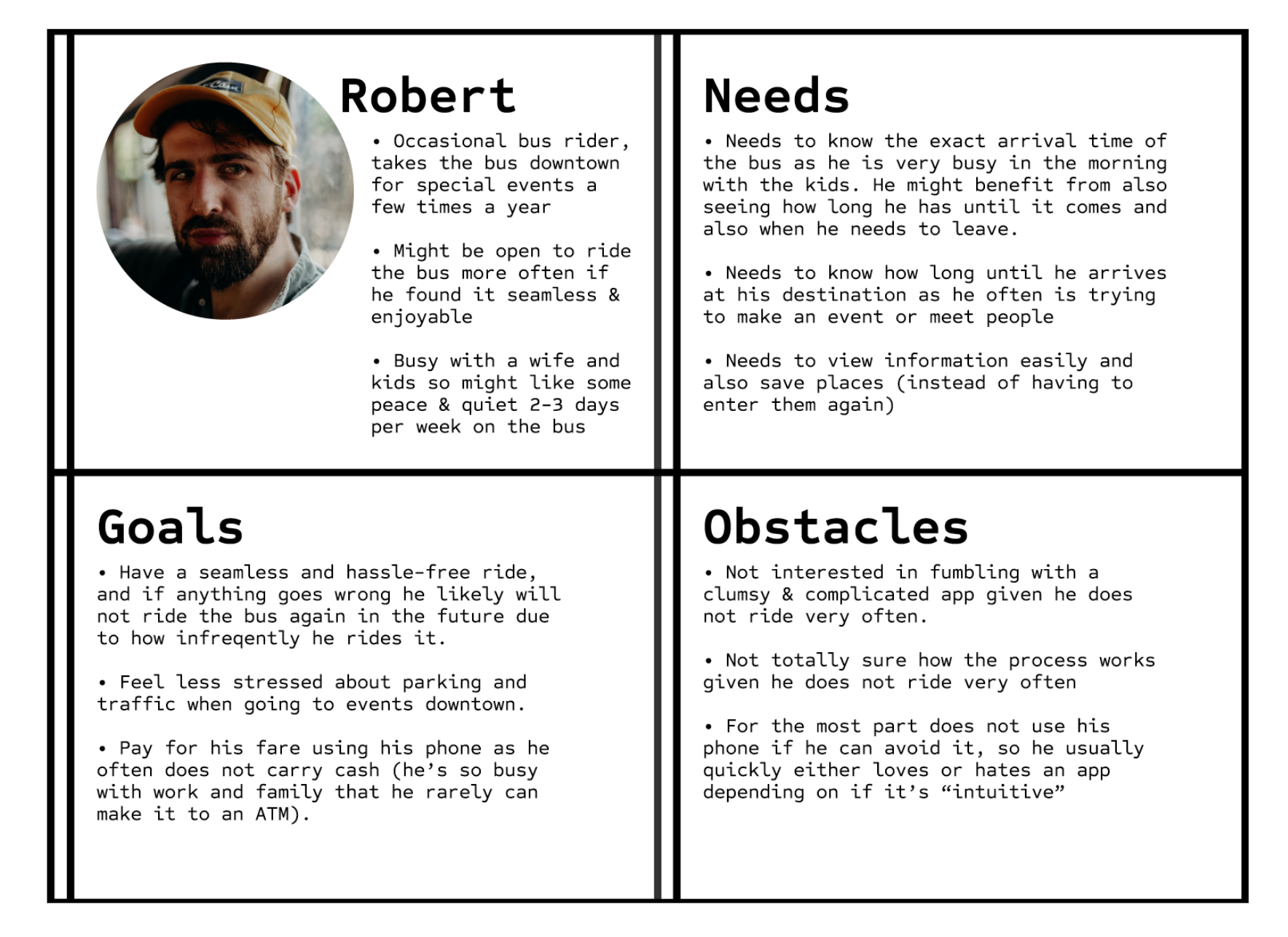
Defining specific problems lets an understanding be gained for how a user persona relates to its solution.
Equally important is to recall the scope i.e. objective of the design sprint.
The key: Clearly defined constraints, otherwise tasks cannot be viewed in a practical way that creates insight.
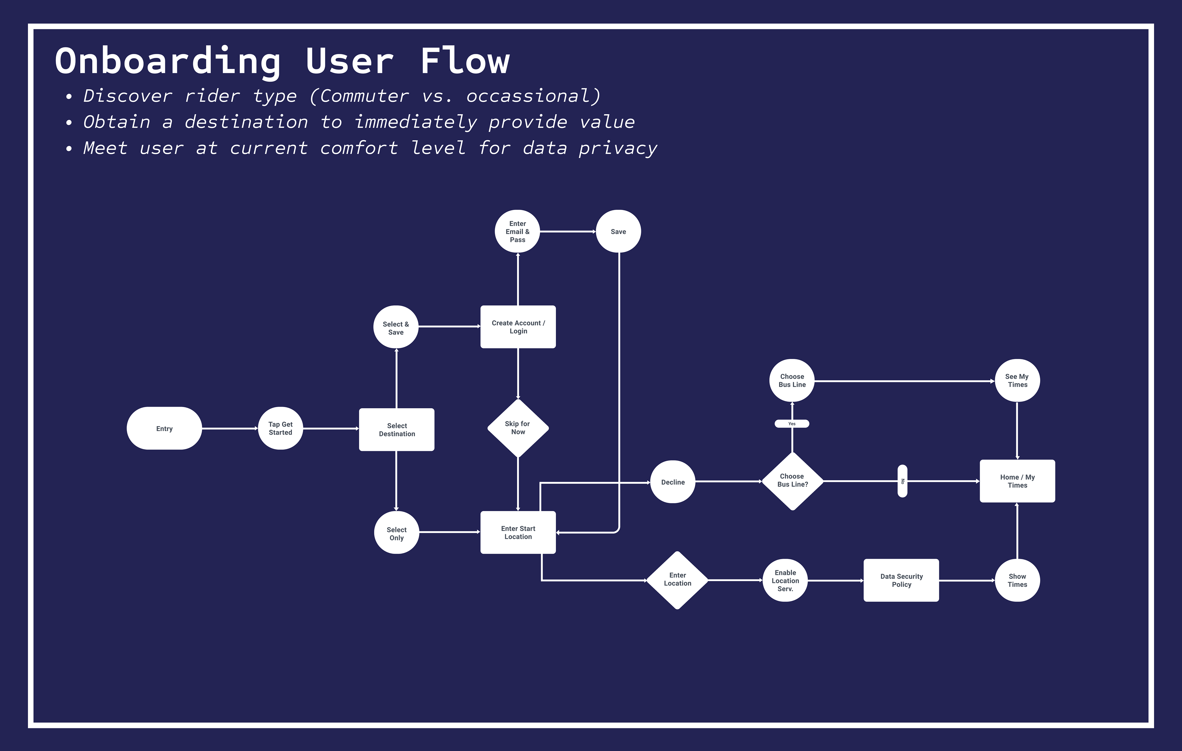
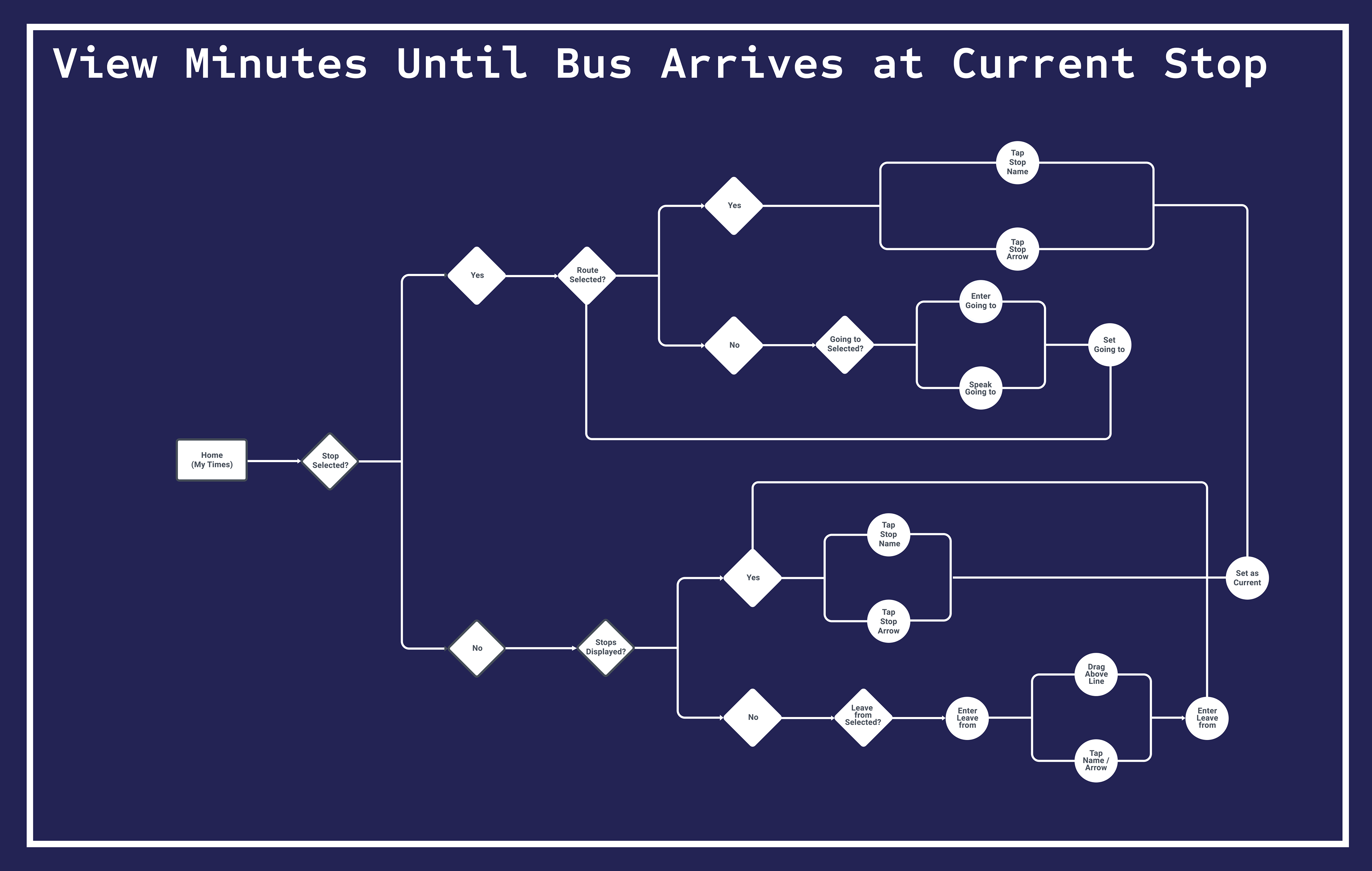
User Flows: Intentional Planning
Having a clear understanding of task importance creates a framework that can be bounced off of research data to arrive at a functional user flow.
Ideally, each step in the interaction lies where user needs meet business goals, with each decision supported clearly by research insights.
From Sketches to Wireframes: Finding Purpose
Initial sketch and wireframe direction was quickly found to be off-base and forced me to re-evaluate how to keep the interaction as simple as possible, which would mean more potential appeal to both user types.
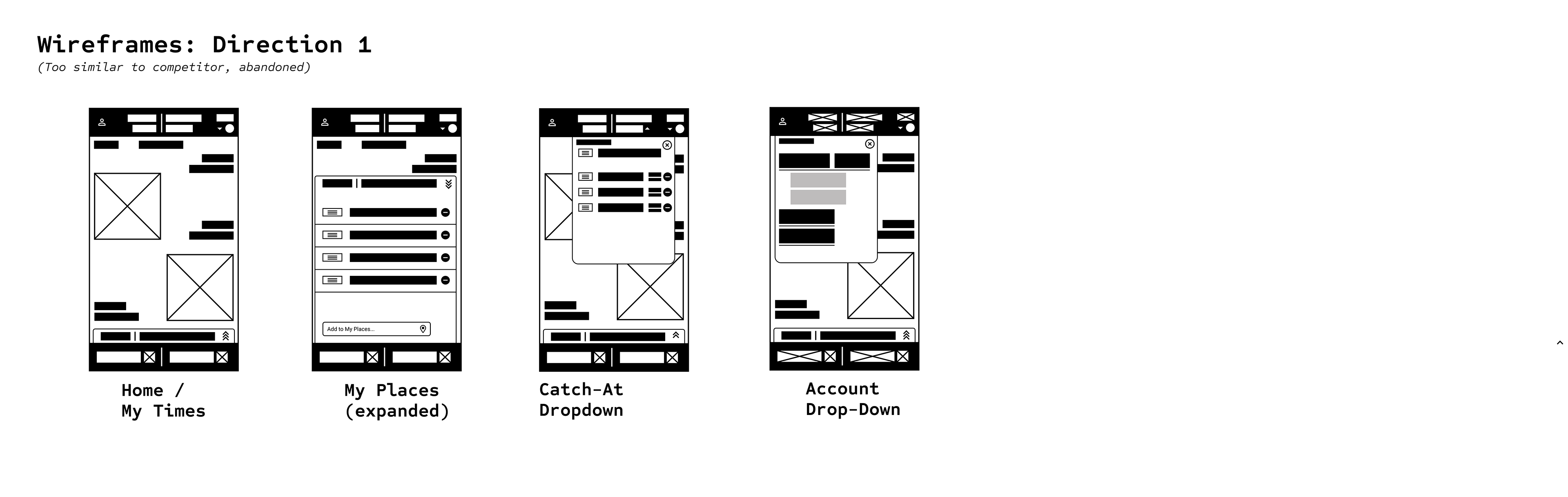
More effective visual inspiration was found in clock-faces and simple, minimalist, color block designs.
Accessibility and appeal to multiple user types were the reason this direction was deemed effective.
Interface design proceeded smoothly after this realization.
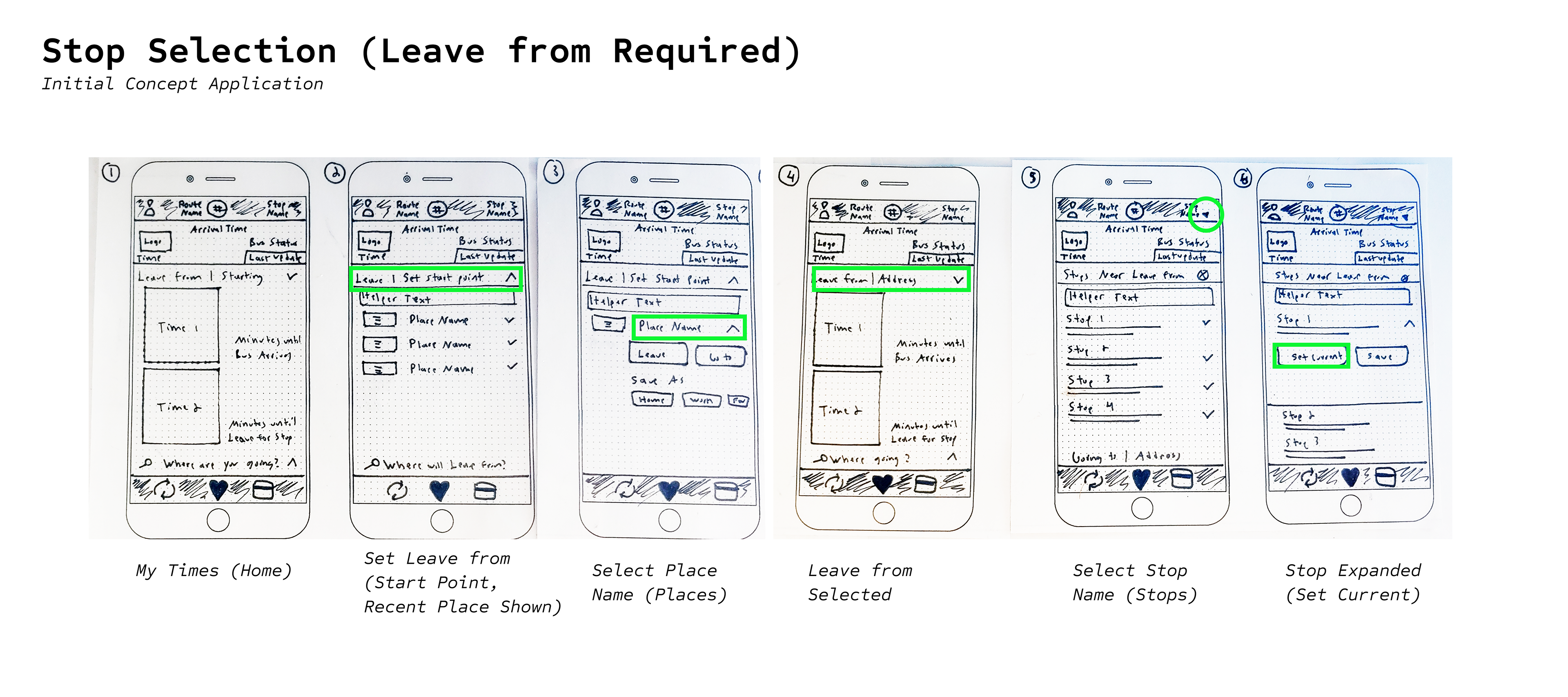
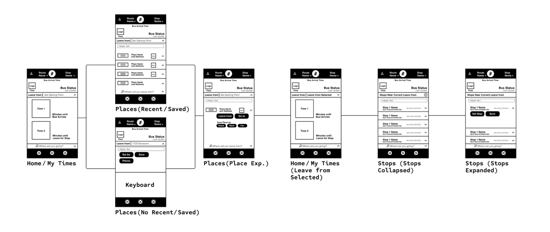
Initial Iteration Through Testing
Information was placed within the horizontal blocks according to its order importance as deemed by user research.
Grouping similar data types also further guided the visual structure and informed how user flows manifested into the initial UI iteration.
Usability Tests
Usability Testing was fruitful and showed blind spots and assumptions made in regards to the design chosen for some "tactile" user elements.
Splitting the Leave From and Going to "bars" to convey an origin-destination experience was somewhat ineffective, influenced by the visual distance and tendency of the numbers to grab visual attention.
Future iterations would incorporate a Leave from/Going to "bar" above the times, as commonly witnessed within industry competitor interfaces.
Overall, tasks were completed in a generally successful manner (75% and up) and users effectively "learned" the interface with successive tasks being completed quickly.
Information on usability results can be seen here: (Usability Results).
Next Steps
Upon review of the project by stakeholders, it was deemed that if a map is not to be incorporated, some form of navigation to stops may still be required.
The time-based interface positions this concept to be adapted into an Apple watch-style experience where walking time and distance is used along with vibration feedback and direction arrows to assist users in arriving at their stop.
Thank you for reading.