Meet chévere, and meet José.
chévere. It's pronounced CHAY-vehr-ay, and means "cool" in Spanish slang. What could be cooler than strolling through a sunny South American marketplace shopping for handmade pieces crafted from vibrant villages?
chévere recreated on mobile the experience of shopping in a Peruvian marketplace. Blending content with commerce, and a creative use of filters, we delighted the client and brought them back to their time spent perusing the streets of Peru.
Roles & Responsibilities
I worked hand-in-hand with the client performing a variety of roles to create a unique mobile shopping experience where users first "meet" craftspeople before they buy.
From our first conversation to their last mention of "rad," I utilized various tools and methodologies to generate a thorough understanding of the elements necessary to most effectively bridge the gap between buyer needs and business goals.
Deliverables
The client received a fully clickable, high-fidelity prototype of the design target: an e-commerce purchase process.
See the full prototype here: (Figma Link)
See the full prototype here: (Figma Link)
Tools
Cloud-based design software, Figma, was paired with remote user testing platform, Maze, to test multiple iterations and present findings back to the client.
Heat maps and click maps were used to analyze user behavior to decode patterns hindering success. I then iterated upon findings, and achieved a measured increase in task success.
Initially, the client interview proved critical to uncover a key concept that would lead to the answer effectively pairing user needs with client goals.
The Problem
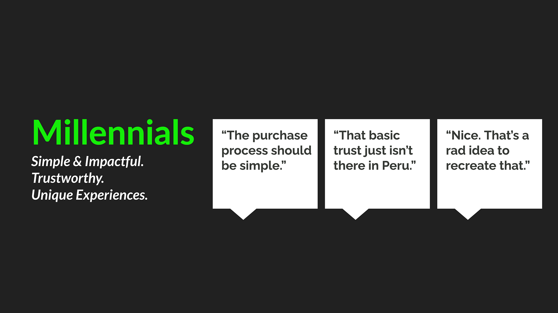
Millennials place high value on experiences over material things and strongly desire to feel their purchase makes a social impact.
Problem: How can we use the client's goal to sell handcrafted South American imported goods in a way that connects with Millennial buyers?
Target Market
The audience was chosen as 25-35 year old Millennials. Impact-hungry. Socially-conscious. Career-established. Starving for self-expression.
The Solution
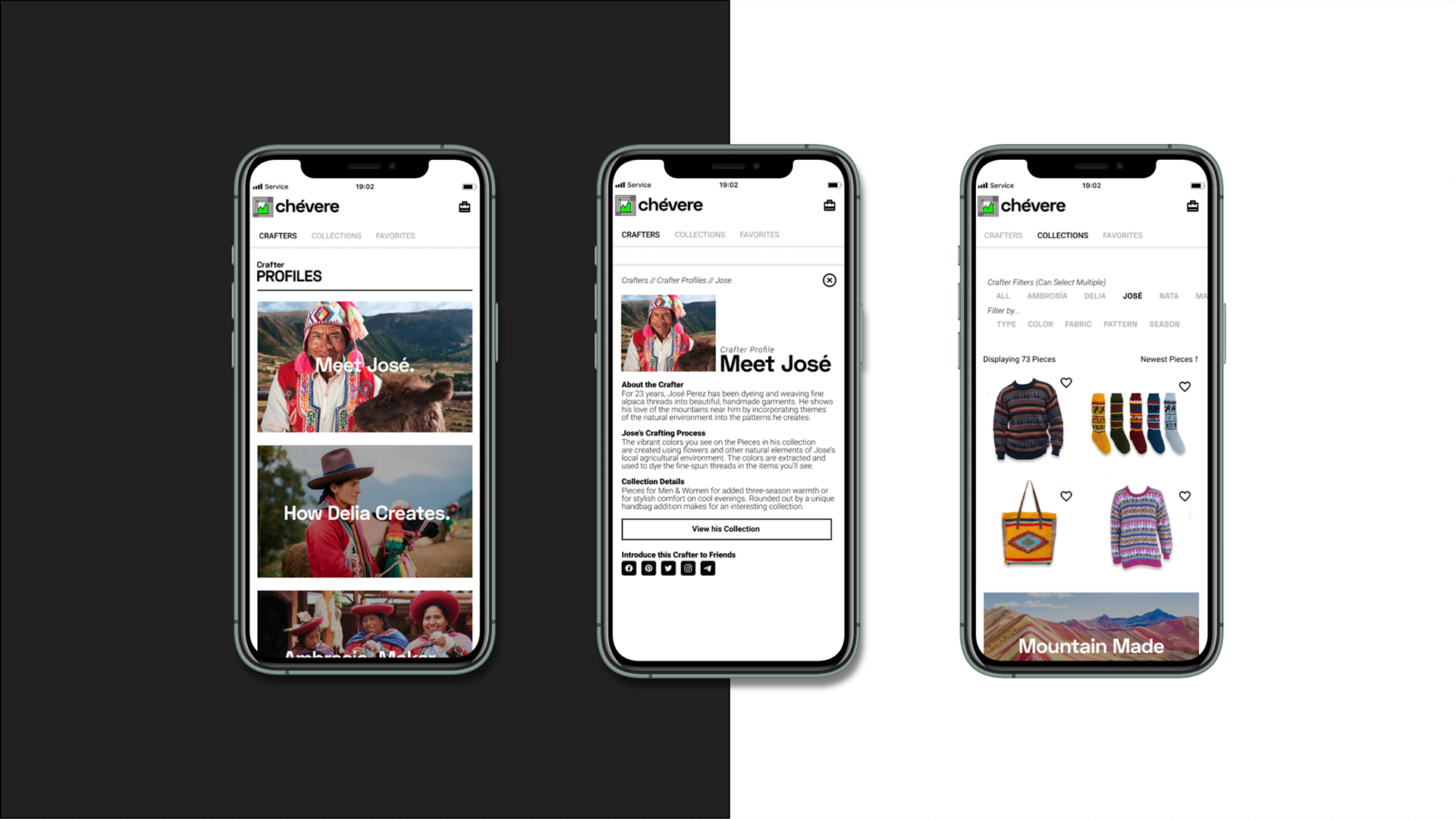
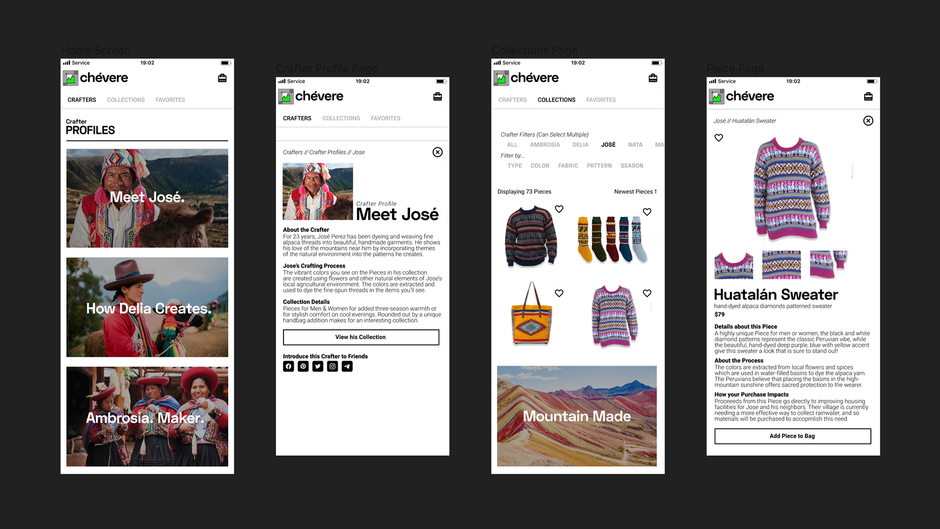
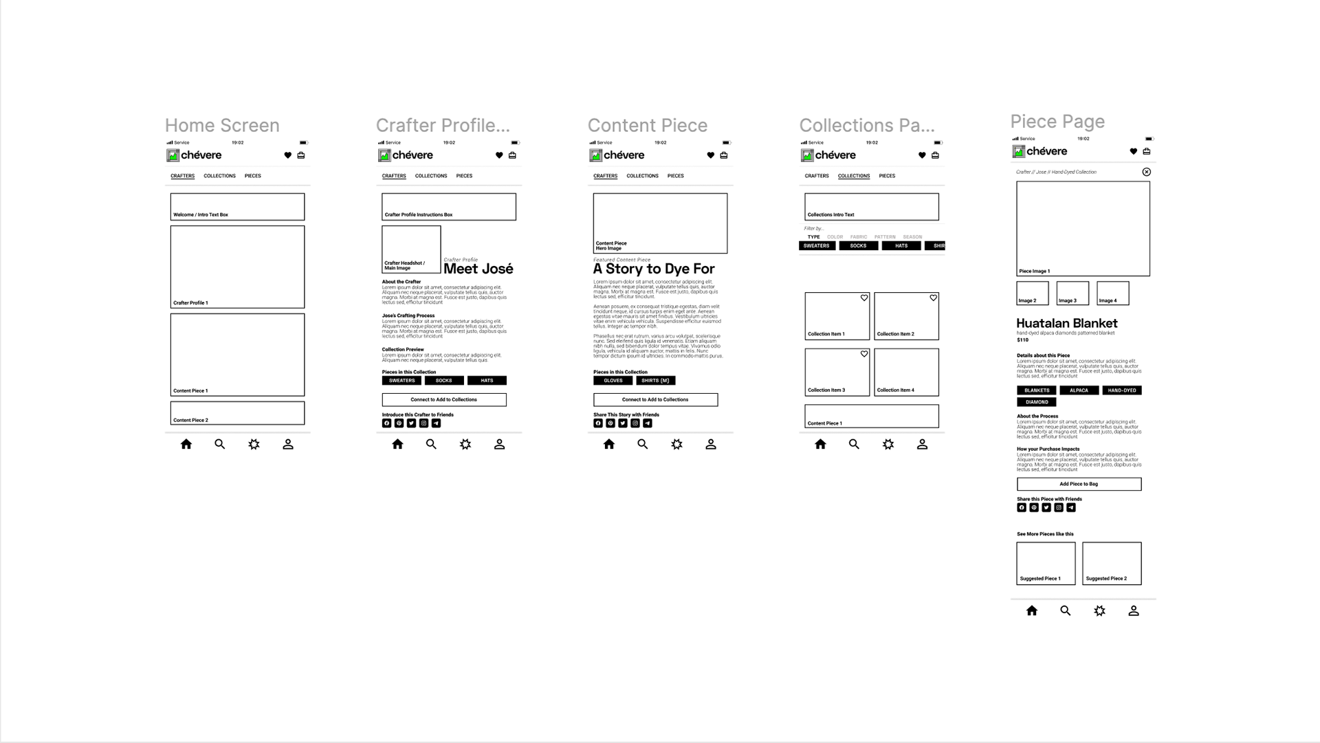
Users get the unique experience of getting to know the crafters from whom they're buying, prior to shopping their items for sale.
Writing towards business goals, we chose "Collections" to elevate perception of item quality while breeding honor and focus on the crafters.
Through the curated experience of "meeting the Crafter," we create the feeling of walking up to a booth in a Peruvian marketplace by giving users the chance to read the personal story of their chosen Crafter.
Through the curated experience of "meeting the Crafter," we create the feeling of walking up to a booth in a Peruvian marketplace by giving users the chance to read the personal story of their chosen Crafter.
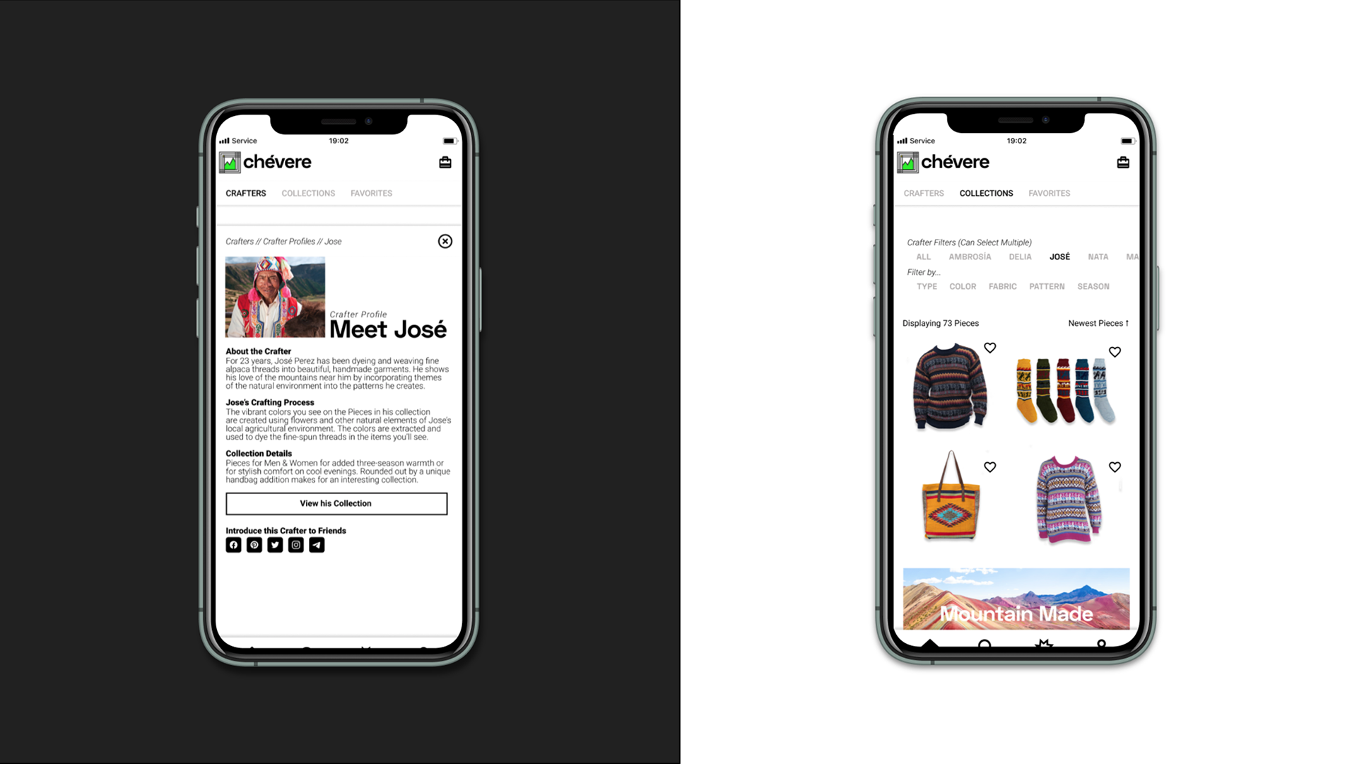
After meeting a Crafter, a tap of the "View his / her Collection" button pairs with a strategic development feature: Pre-Applied Filters.
The button microcopy pairs the action with the appropriate crafter filter applied to their available items in the Collection section.
Now, the user immediately views only the items created by José.
A critical feeling is enabled by intentional experience design.
The button microcopy pairs the action with the appropriate crafter filter applied to their available items in the Collection section.
Now, the user immediately views only the items created by José.
A critical feeling is enabled by intentional experience design.
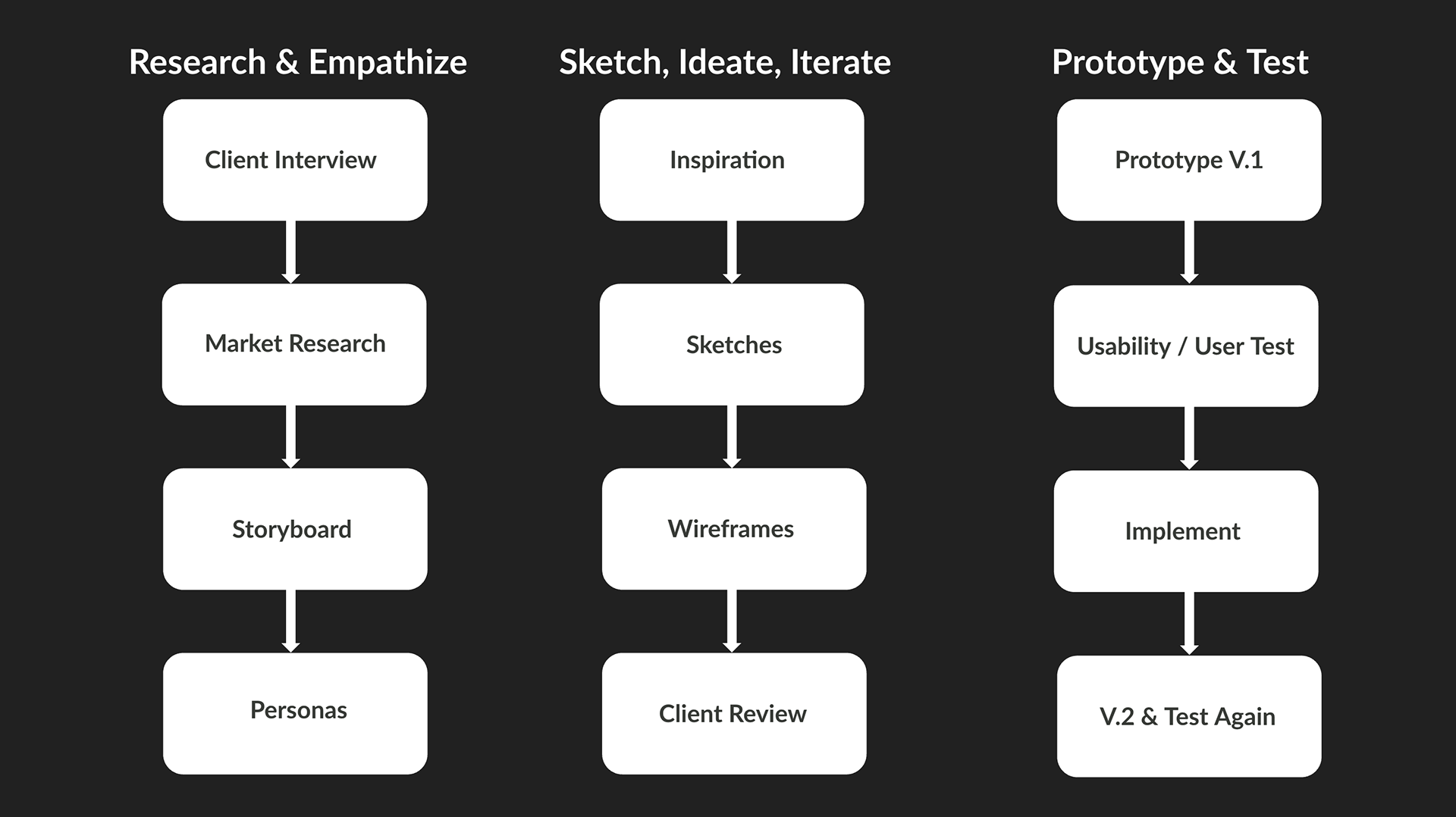
The Process
The initial client interview painted a vivid picture of their personal experience shopping in the Peruvian market. They recounted the insanity and spoke of trust coming at a premium, earned through relationship-building.
It turns out, Peruvians aren't the only ones who need trust in their business interactions.
It turns out, Peruvians aren't the only ones who need trust in their business interactions.
Our target market (Millennials), need to feel trust with a brand before they buy. Market research on Millennial buyer traits were combined with insights from the client interview to establish initial creative constraints for the project.
After hearing the mutual need for trust, it was in this moment the concept for the initial user flow unfolded.
We would focus on recreating the feeling of "meeting a craftsperson," which would simulate the trust needed to do business in Peru.
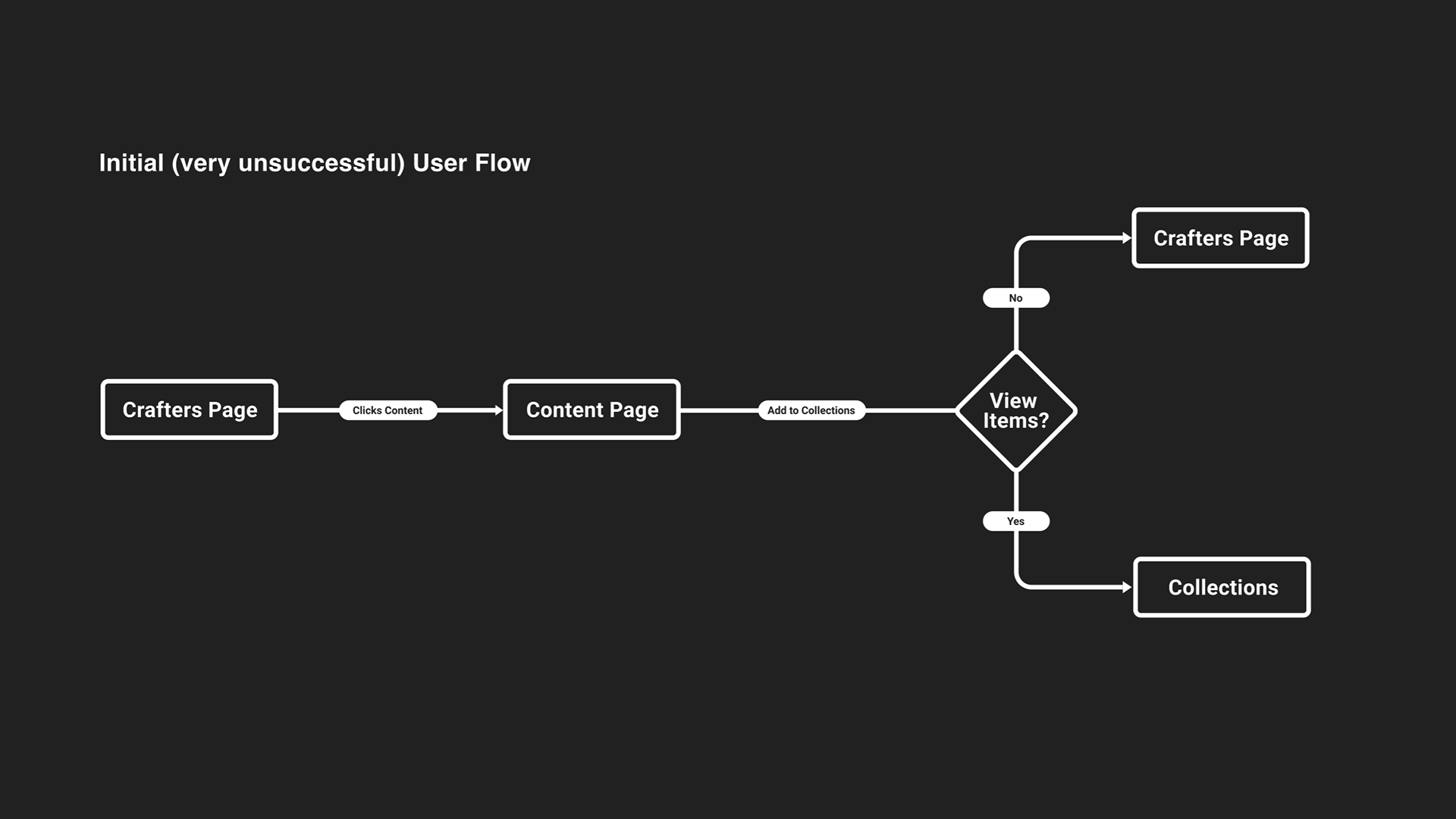
From a Content piece, we initially required a button press to "Add to Collections," from where the user was given a success message of "Added to Collections!'. This assumption was an early (very unsuccessful) attempt to simulate "meeting" a Crafter.
Usability and user testing later in the project quickly revealed that our proposed process was not congruent with the mental models of e-commerce buyers. More information was needed to overcome this discrepancy and smooth the user experience.
We would focus on recreating the feeling of "meeting a craftsperson," which would simulate the trust needed to do business in Peru.
From a Content piece, we initially required a button press to "Add to Collections," from where the user was given a success message of "Added to Collections!'. This assumption was an early (very unsuccessful) attempt to simulate "meeting" a Crafter.
Usability and user testing later in the project quickly revealed that our proposed process was not congruent with the mental models of e-commerce buyers. More information was needed to overcome this discrepancy and smooth the user experience.
In order to learn more about how Millennial buyers might use an e-commerce app, I performed a variety of exploratory methodologies, harnessing empathy to more deeply understand the buyer's needs and expectations.
Storyboards combined with prior market research to form proto-personas from which design decisions could be based.
Getting into the buyers world, we realized she's strapped for time. User session length would vary, which meant we needed a simple overall structure, to support her goals:
Storyboards combined with prior market research to form proto-personas from which design decisions could be based.
Getting into the buyers world, we realized she's strapped for time. User session length would vary, which meant we needed a simple overall structure, to support her goals:
• Resume an article
• View a saved item
• Complete a purchase
• Share something she's found with friends.
• View a saved item
• Complete a purchase
• Share something she's found with friends.
Empathizing with the User: Storyboarding
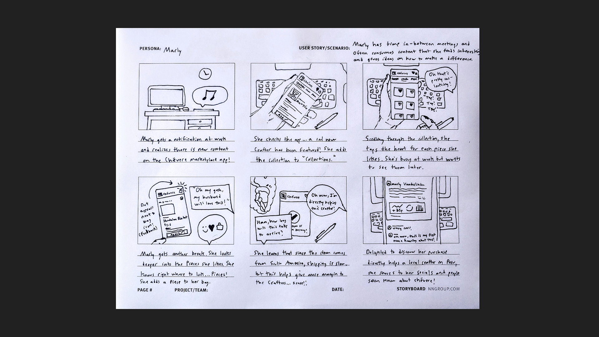
Furthermore, her needs might change based upon her mood or her situation. She might feel like reading an interesting article on her lunch break, then might take a short break to look up a few interesting scarves or handbags to compliment her wardrobe.
Pairing UI with UX: Seeing Connections
After empathizing with the user and creating a proto-persona, I harnessed their goals further to pinpoint visual elements that connected goals with specific UI features.
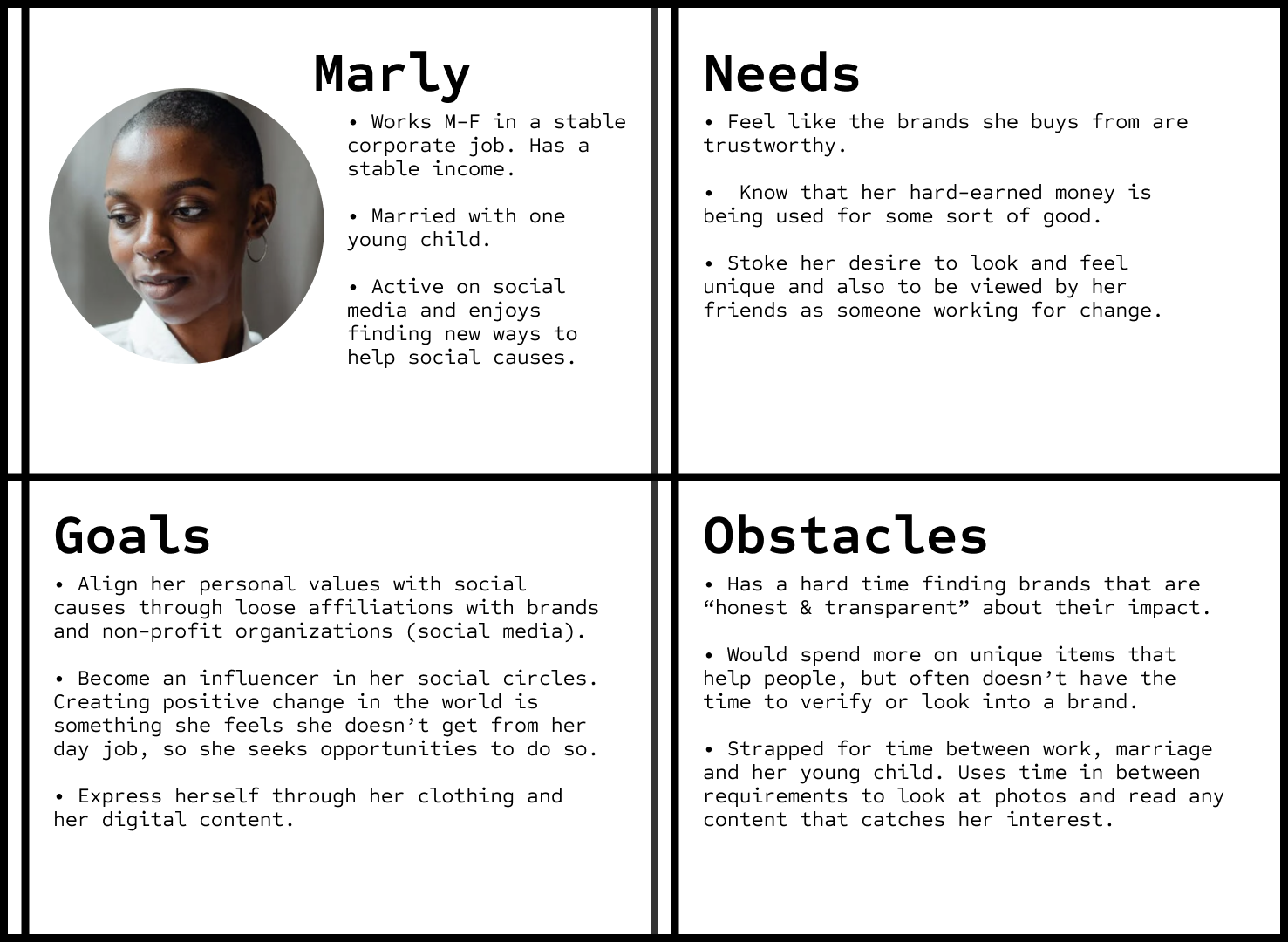
Example: A time-strapped Marly saves an item from 'Collections' to 'Favorites.' Upon returning to the app a few hours later, the simple left-to-right Nav menu allows her to quickly locate where those items are saved, and reach them with a single tap. This visual element visually and conceptually mirrors a start-to-finish purchase process.
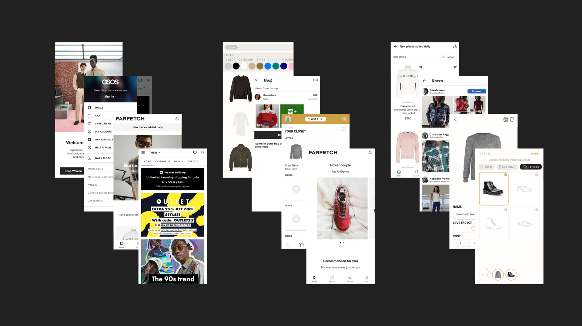
Fashion e-commerce apps were the main source of inspiration searching for visual elements that would compliment the desired user experience.
Example: A time-strapped Marly saves an item from 'Collections' to 'Favorites.' Upon returning to the app a few hours later, the simple left-to-right Nav menu allows her to quickly locate where those items are saved, and reach them with a single tap. This visual element visually and conceptually mirrors a start-to-finish purchase process.
Fashion e-commerce apps were the main source of inspiration searching for visual elements that would compliment the desired user experience.
This process of discovering connections between desired user experience and supporting user interface elements informed the initial iteration.
In pairing user needs with business objectives, a well-informed visual interface could be synthesized into one that supports the all-important user tasks.
In pairing user needs with business objectives, a well-informed visual interface could be synthesized into one that supports the all-important user tasks.
Building Trust, Through Familiar Elements.
Knowing that Millennials carry an inherent burden-of-proof towards trusting brands, they also don't have much time to find out. They need to feel it immediately.
A initial interface design was intentionally selected from sketches that was deemed supportive of many of the overarching user requirements.
A initial interface design was intentionally selected from sketches that was deemed supportive of many of the overarching user requirements.
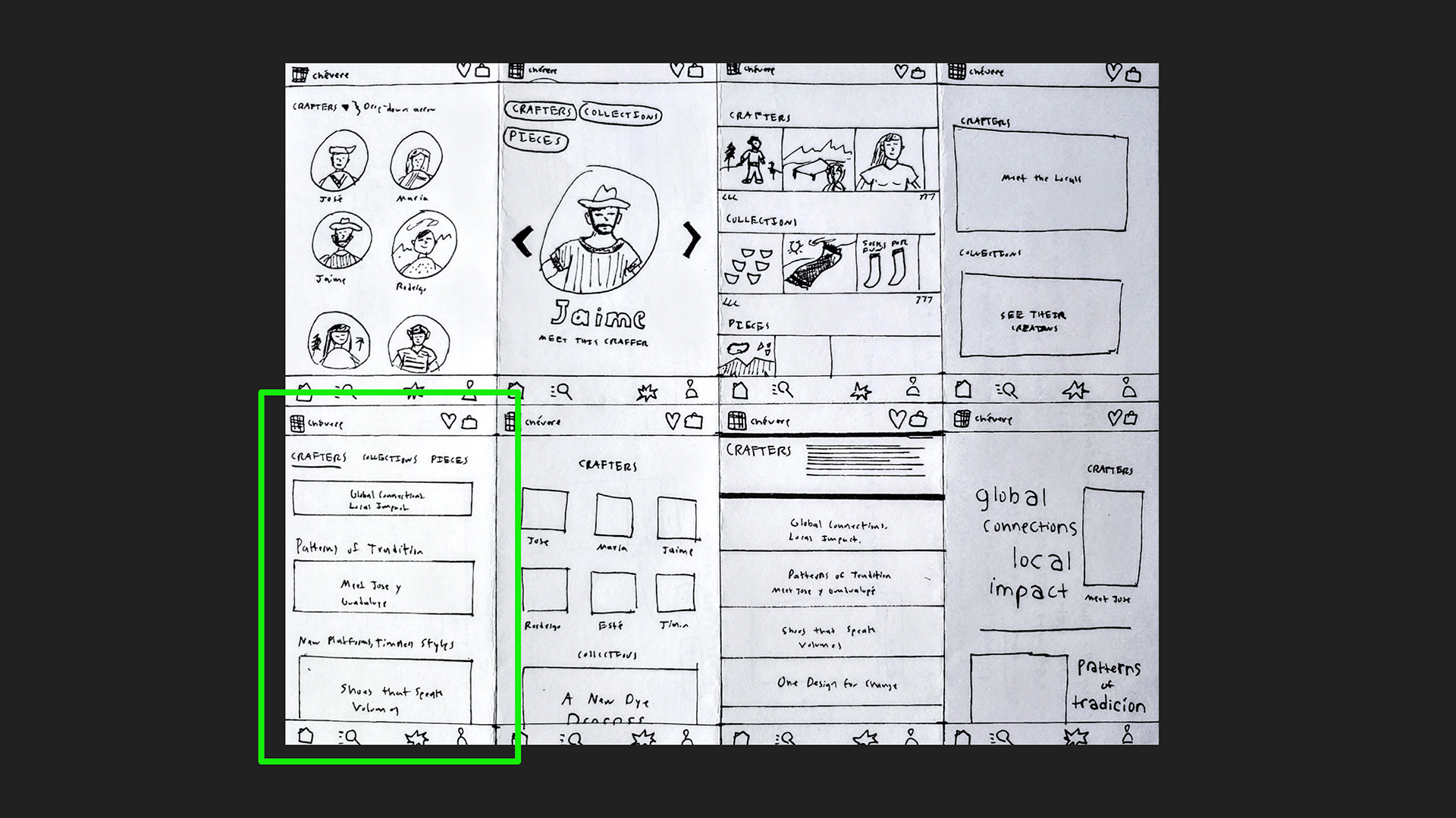
The above highlighted iteration sketch was quickly determined as stand-out.
• Places importance on people by making the Crafters the home screen.
• Time-strapped users can easily return to exploring content, browsing items, viewing saved items, or checking out. A familiar purchase process is visually and logically illustrated from left-to-right.
• The infamous and trending scrolling feed structure is harnessed to cultivate further familiarity i.e. trust in the app itself, while maximizing new experiences with new content.
New content = new opportunities for products = new opportunities for self-expression.
Initial Iteration Through Testing
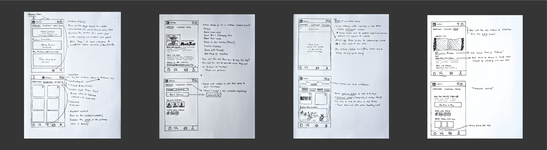
After arriving at an initial interface design that supported the desired user experience, we moved through wireframe sketches, to digital wireframes. then prototyping using a content strategy that further supported user needs.
Key Assumptions & Findings
The first rounds of usability and user testing were fruitful. We asked users to perform four key tasks (two of which are shown here) and uncovered key assumptions to then remove extraneous elements present in the design that detracted from task success:
Task 1: Add a Collection from a Crafter Profile Page
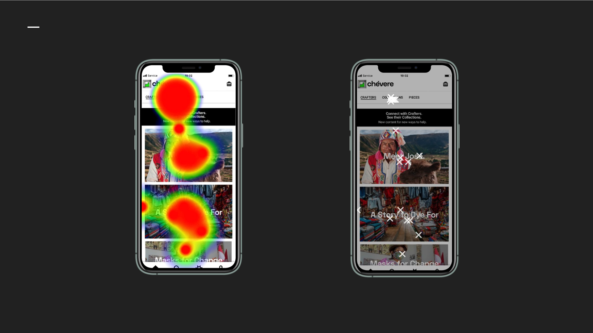
Screen 1 Assumptions
Assumption 1: Underlining "Crafters" on the Navigation bar would be adequate to communicate where the user would find the next step for success.
Assumption 2: The image of crafter and the mention of their name in the content title would be enough to communicate what a "Crafter Profile" page is, and where it could be found.
Assumption 3: The use of a black "helper text" banner would ensure successful completion of the task by clarifying what is shown.
Evidence Against: Despite helper text banner, the majority of users clicked on "Collections" directly, or instead clicked on a "general content" piece that was not in fact, a Crafter Profile.
Actions Taken:
• Increased visual contrast of Crafters menu item on Navigation bar
• Added a "Crafter Profile" label in place of helper text banner
• Visual separation of content types to better communicate content structure
Resulting changes showed a demonstrated increased understanding of content types as they relate to successful task completion.
The increase in user task success an accompanied significant decrease in bounce rate.

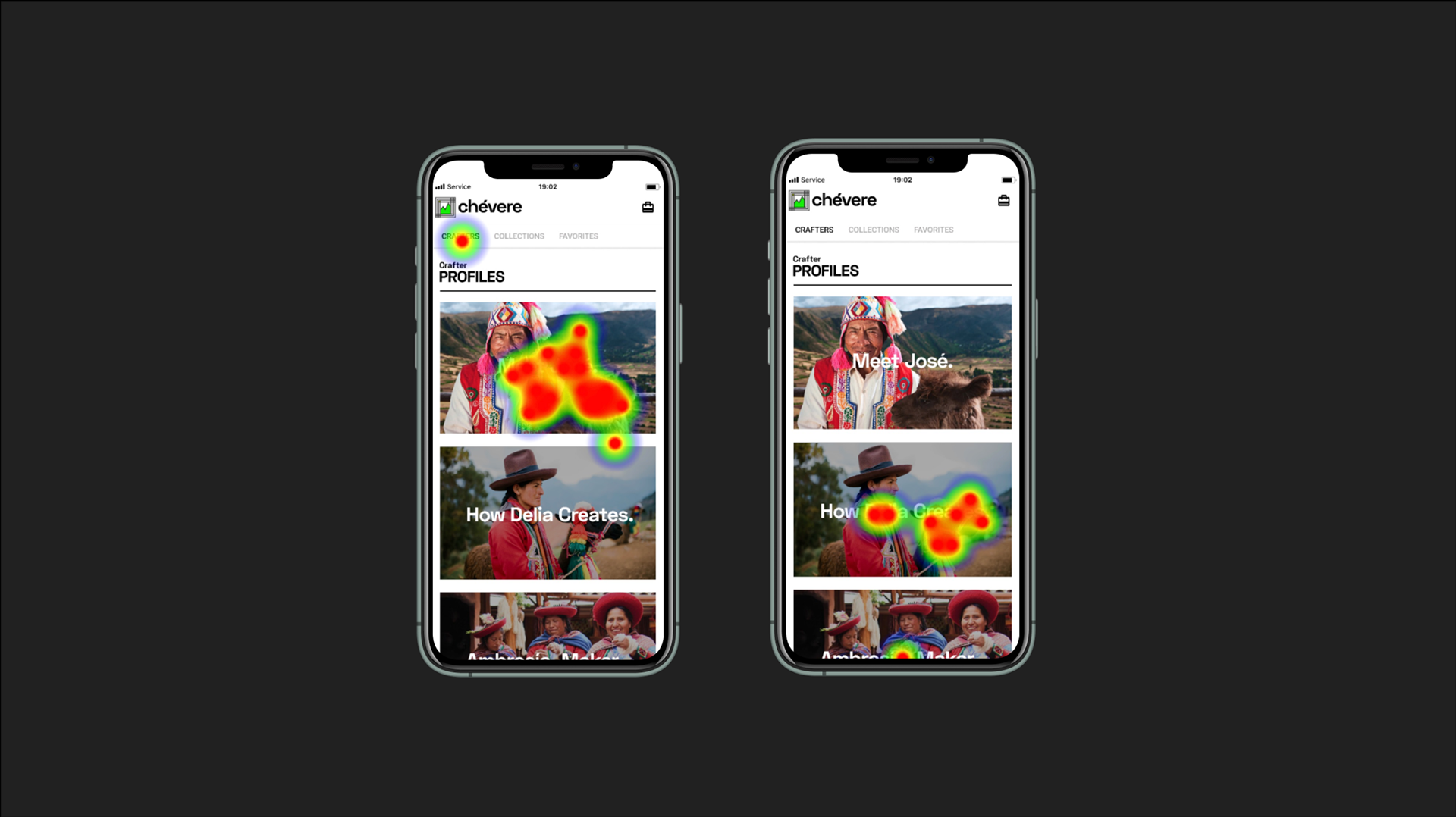
Smoothing the User Flow
Now that the first hurdle had been cleared, confusion remained surrounding the structure of the user flow to
(1) View a Collection and (2) Apply a Filter to that Collection. These tasks were deemed critical as:
(1) View a Collection and (2) Apply a Filter to that Collection. These tasks were deemed critical as:
• The concept of viewing a collection of items associated with a crafter meant forming a personal connection.
• Allowing the user to "personalize" their shopping experience, catering to the need for self-expression and unique experience, strikes the values of the target market.
Initial screens showed confusion regarding UX copy, visual design and interaction structure.
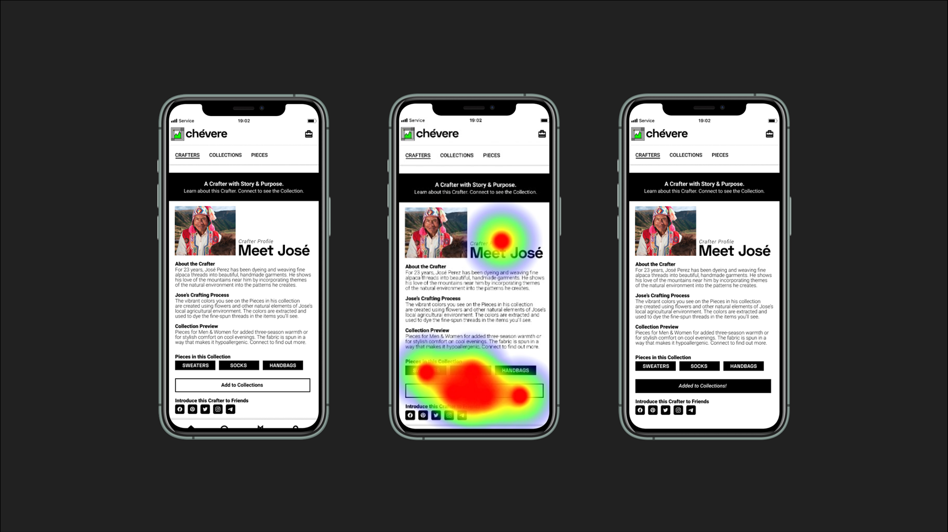
Assumption 1 (left): Using the phrase "Add to Collections" on the button would be adequate to allow for successful user task completion
Assumption 2: The use of "Category Labels" would help a user understand where an item could be located in the filtering matrix.
Assumption 3: Giving a success message (Added to Collections!) only upon completion would create to the experience of meeting the Crafter.
Usability Testing Feedback
• Showed the "Add to Collections" button text was confusing in multiple ways. One subject even hovered over it with their finger, then chose a different path completely.
• Users expected to be taken to the Collection upon button press.
•Heat mapping showed a considerable number of clicks on the Category Labels, presumed to be button because of their visual design, further detracting from task completion and confusing users in the process.
Changed button text to "View his / her Collection"
Removed category labels completely.
Restructured UX to display the Crafter Collection (items) upon button press!
Testing Results
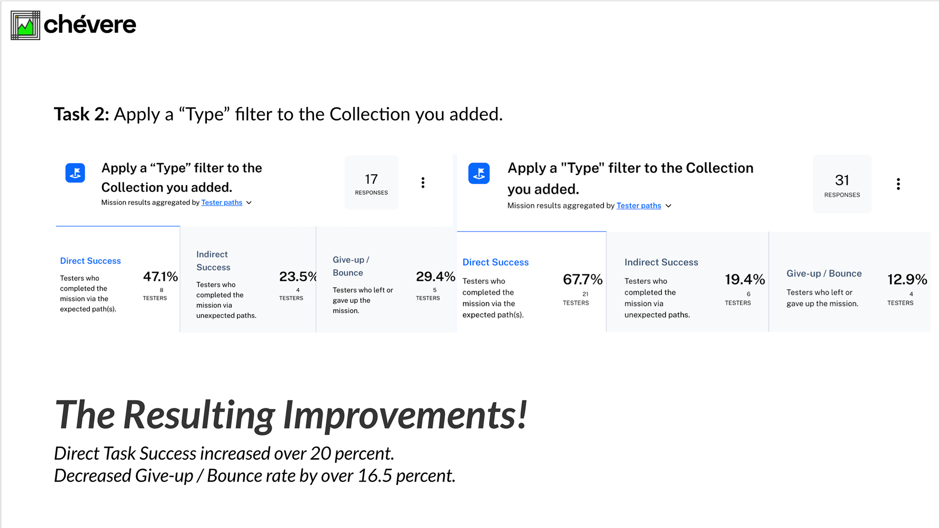
Capturing extraneous clicks by removing confusing labels, changing UX copy and simplifying the user flow resulted in increased Direct and Indirect task success.
Next Steps
It is curious that despite the task being explicitly stated to add a Collection from a Crafter profile page, a sizable portion of those surveyed still clicked first on "Collections."
We are interested if this may simply be indication of a user type that prefers to view items immediately (instead of preferring content), or if this pattern is the result of the word order of the task itself, "Add a Collection from a Crafter Profile Page."
Changing word order of the task would be extremely telling as to the effectiveness of the home screen, as it was deemed critical in testing to keep wording the same so as to clearly quantify results of visual and UX changes.
Regardless, we are very pleased, and the client delighted, with the final product.
Final Thoughts
The chévere project was extremely enjoyable and unfolded in a manner that was consistent with the creative process I have come to know well. It's a process best-described as, "realizing it's unfolding when it seems like it's just fluff."
The largest question that remains is, "Does the word order of user task influence the success or failure of the user?" I believe the answer to be a, "Yes, of course," but in the case of chévere, the results of that task also support the existence of two individual user types. The next iteration of the design will surely evolve from the testing of the current iteration, but changing the wording of the tasks to uncover the effects.
Thank you for reading.